Are We Dying Yet?
A Climate Change Weather Mobile App Visualizing 125 Years of DataOverview
When we make statements like “The summers used to be much cooler. Global warming is real”, what does it really mean?
When there is already an overwhelming amount of information on climate change — How can I help the audience overcome climate-fact fatigue and engage on a topic that is seemingly saturated and almost too familiar?
Are We Dying Yet? is a climate change weather app that visualizes weather data at current location as well as weather data from the past 125 years across all US counties. It presents climate change information in a local-individual context and uses dark humor to communicate the relationship between weather and climate in a more human and approachable way.
Role
Concept, Interaction & Visual Design, Development
Tools
JavaScript, Java (Processing), HTML/CSS, Adobe Illustrator
Remarks
Developed during an internship at Fathom Information Design
Concept, Interaction & Visual Design, Development
Tools
JavaScript, Java (Processing), HTML/CSS, Adobe Illustrator
Remarks
Developed during an internship at Fathom Information Design
Process: Choosing & Parsing Data
I first decided on NOAA’s Global Historical Climatology Network’s daily summaries (GHCN-daily) after consulting Dr. Randall Cerveny, Rapporteur on Extreme Records for the United Nations/World Meteorological Organization. I wanted to use a global database as I hope the project could expand from a Euro-American centric worldview, especially when climate change has more severe impacts in countries in the tropics than the developed north. I switched to the GHCN-monthly dataset as there are too many fluctuations in a daily dataset, the question of how to accurately and best communicate the relationship between weather and climate is one I kept coming back to.
I worked with Mark Schifferli at Fathom to parse and organize the data. Despite my intent to use the GHCN-monthly data, the organization of precipitation and temperature datasets would add much complexity to the data parsing process, so instead, we chose the U.S. county based Climate Divisional Database (nClimDiv), which offers much granularity. We also gathered global weather data from NOAA and Berkeley Earth to offer a local vs. global perspective.
Process: Initial Visualization
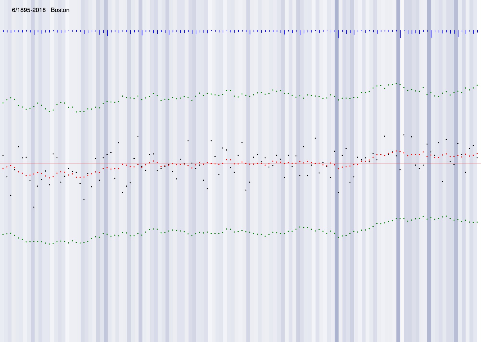
After parsing all the data, I made a quick sketch in Processing to understand the data. Below is the June Average Weather Data (1895-2018) in Boston and San Diego.
- Blue lines: Precipitation intensity
The comparison shows SD being much drier and also having a much bigger spike in temperature in recent years. - Green dots: Max, Min temp. Red dots: 10 years average, smoothed vaule. Black dots: Average temp. Red line: Global Average temp.

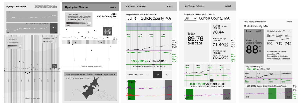
Process: Design Iterations
I worked back and forth in Illustrator and Processing.
![Design mockups for climate change weather app]()
Research Observation: While weather and climate change are familiar subjects, projects around them are not always easy to understand. At times, there is too much information. In others, terminologies are not explained, for instance, many use temperature anomalies (in the degree of change from the 1951-1980 baseline) over absolute temperatures. While this is scientifically more accurate, temperatures anomalies and preindustrial baseline are relatively foreign concepts for the general audience.
The initial iterations layout was too busy and require additional annotations. The design became more of data analysis than an app.
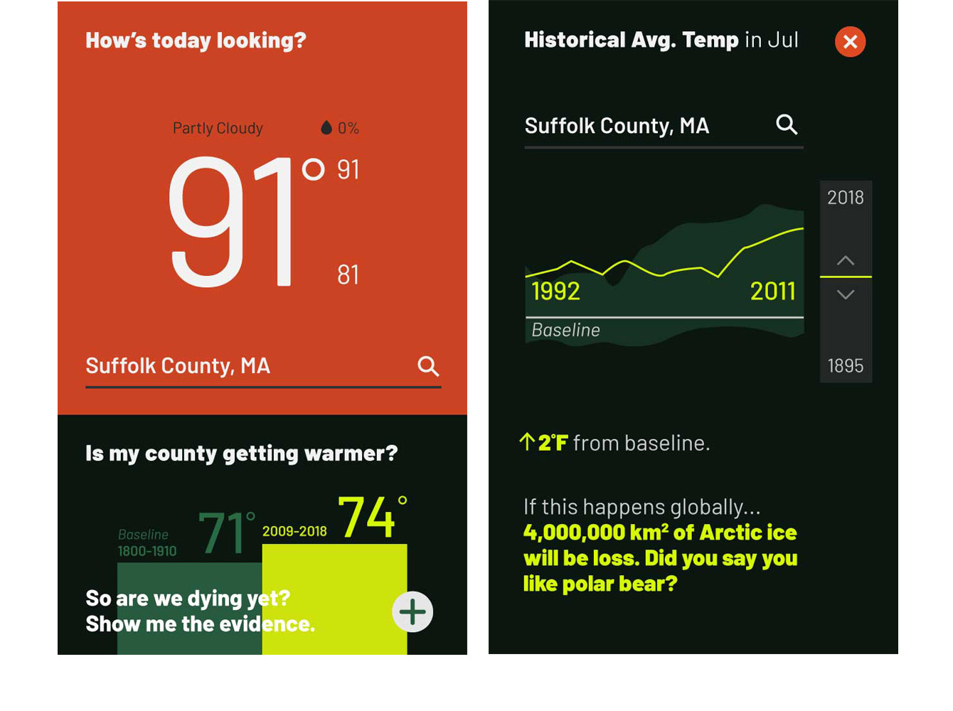
Final Design
The landing page shows the current temperature and an overview of temperature change in the of that month in the last decade in the viewer’s county. I designed two very different treatments to distinguish between current and historical data because it is misleading to make a direct comparison.
When the viewer taps on the expand button, the detailed historical page will pop up. Viewers can slide through the years to see changes in average temperatures, and depending on the degree of temperature change, a different snarky statement about the impacts of climate change will appear.
When the viewer taps on the expand button, the detailed historical page will pop up. Viewers can slide through the years to see changes in average temperatures, and depending on the degree of temperature change, a different snarky statement about the impacts of climate change will appear.