
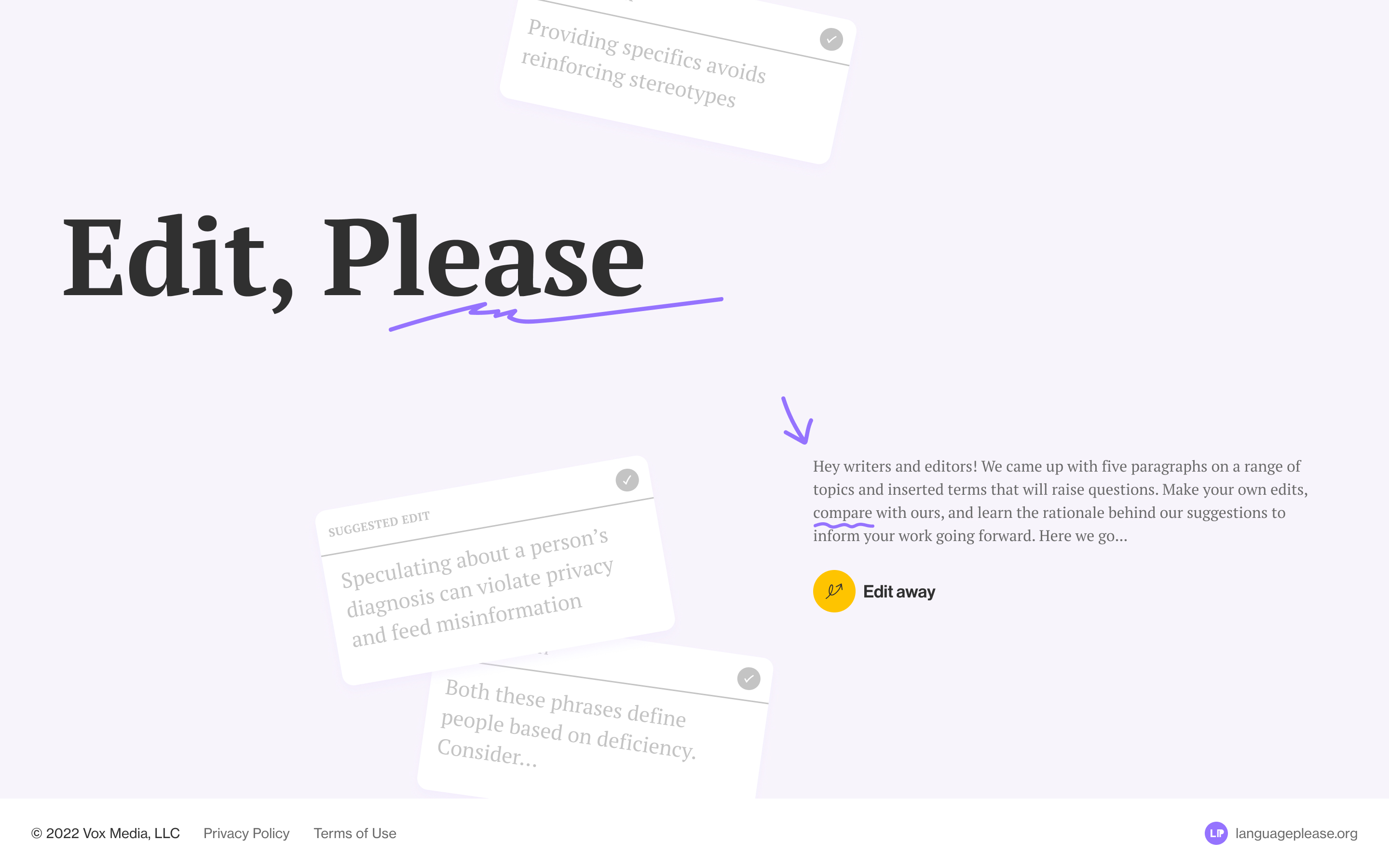
Edit, Please
Interactive tool informing journalists on appropriate language and framing
Prompt
I was approached by Vox Media to create a tool to inform journalists on how to approach language and framing on coverage of communities and identities. This project is part of their larger Language, Please initiative — a free, living resource for journalists and storytellers seeking to thoughtfully cover evolving social, cultural, and identity-related topics.
Outcome
An interactive learning tool, in the format of an edit test, to help journalists learn in context and share their perspectives with their peers. We also delivered an intuitive CMS for newsrooms to keep content in the tool relevant. In addition, I expanded on limited brand assets to create a visual identity and develop a design system.
The tool was successful that Vox has reached out again to create another iteration for HR context, and is looking to futher develop the product.
Role
I was the designer and project manager on the project, working closely with a developer and editors at Vox to oversee the entire project — from proposal pitching, shaping, discussing tech stack, to design production and handoff.
Shaping
One of the challenges in the project is the short timeline — we had about two months from concept to deployment.
To faciliate alignment on the core user experience and features, I created site maps, wireframes, and clickthrough prototypes to illustrate a wide range of design explorations. I worked closely with the developer to understand technical implications and together with Vox identified our priorities.
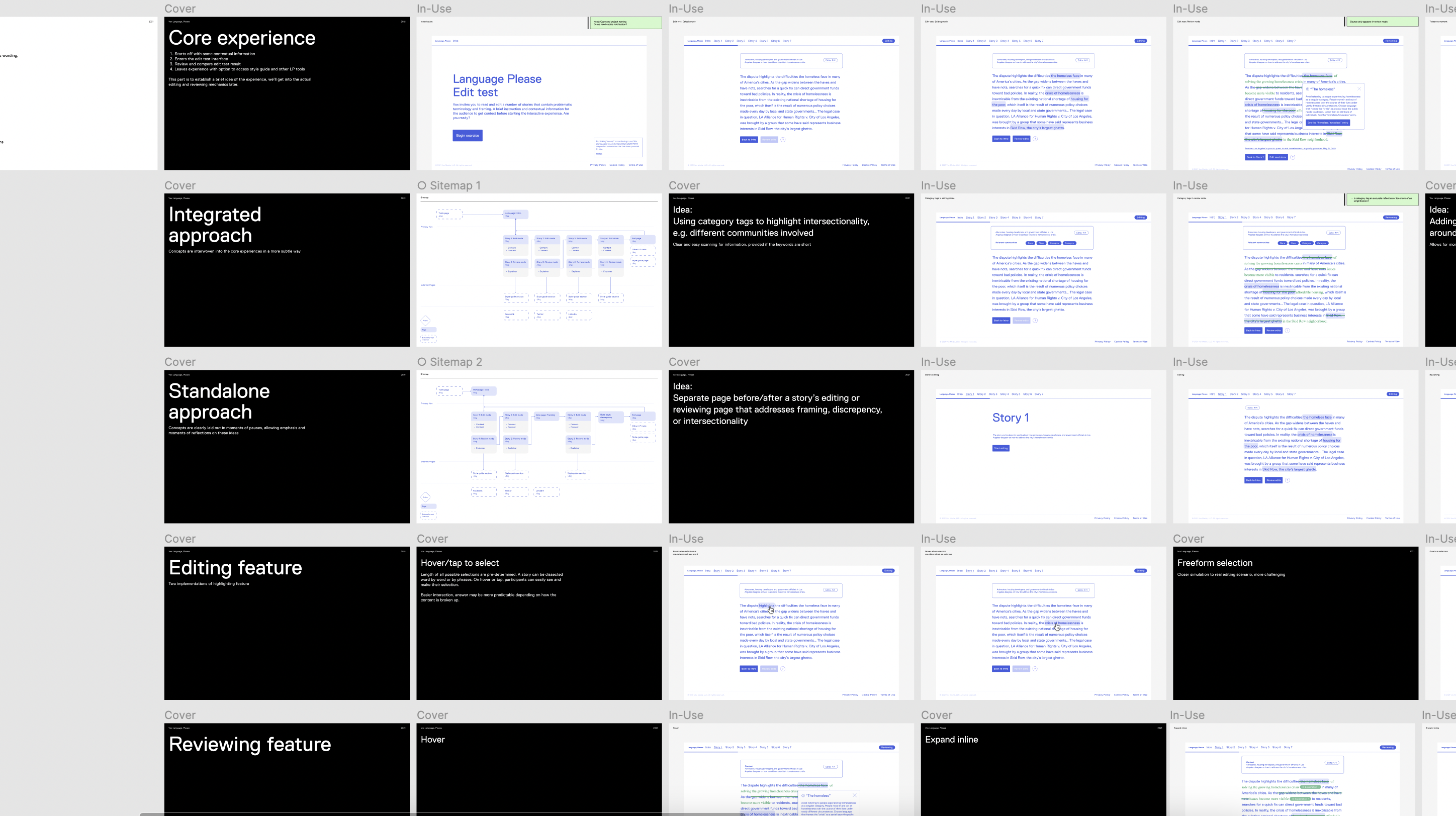
Editing
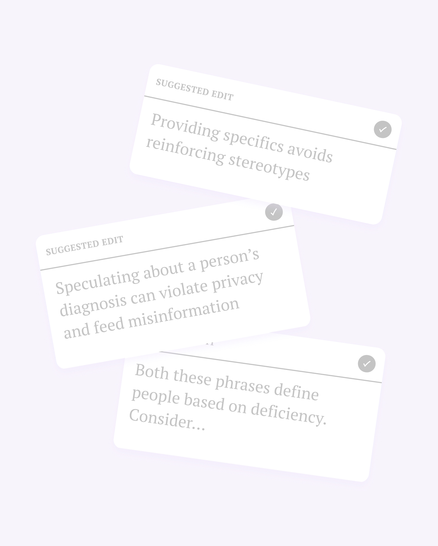
The editing feature is designed prioritizing accessibility and usability. With that in mind, we decided to dissect a passage into “chunks” rather than allowing free-from selection to give users a more guided experience and allow them to focus on providing reasons for their edits.
When users hover or tap through a story, they can easily see the possible options and make their selection.
Reviewing
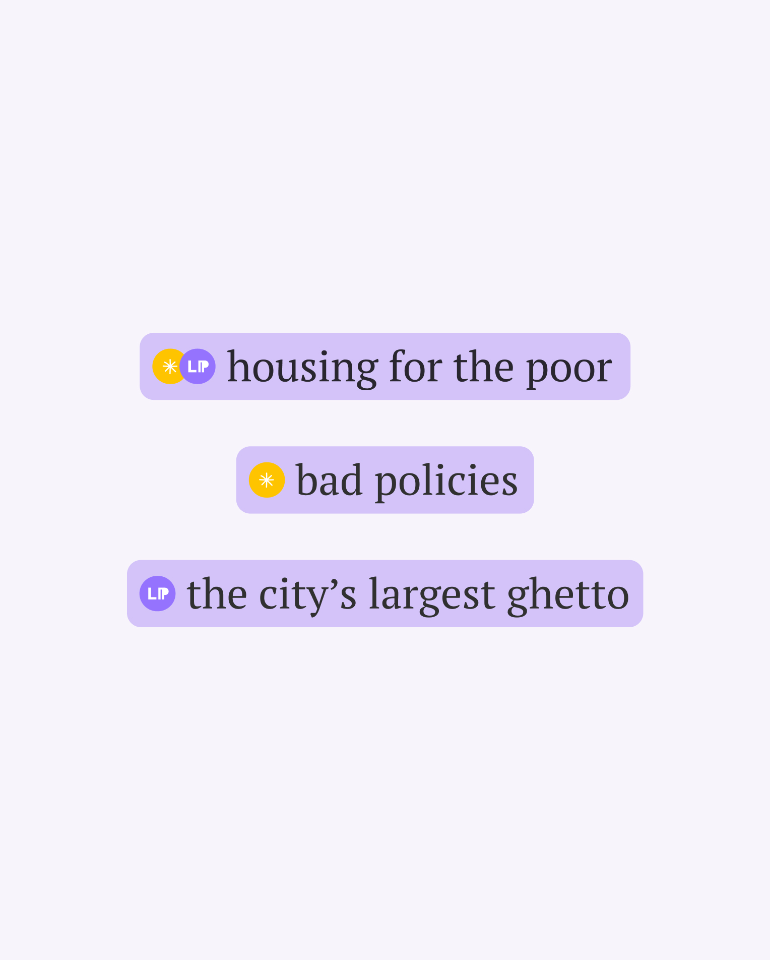
I developed an intuitive visual system to showcase user and Language, Please’s selections in different scenarios. Identity is dynamic, as is language. It was important that the visual approach does not mislead users to think that there is an absolute, or right vs wrong answer.
In the review mode, users can select and review their edits and the suggested edits, learn more through extended readings, and toggle to show a “cleaned” version of the passage with edits incorporated.
Expanding visual identity
I expanded on the limited design assets provided to create an engaging and approachable visual identity.

Takeaway
A selection of additional resources are provided to users to learn more about inclusive reporting.

Scalable design system & CMS
Perspective on language and framing changes over time, I created a scalable design system to accommodate new content and features. I collaborated closely with the developer to create a CMS for editors at Vox to continue iterating on the tool.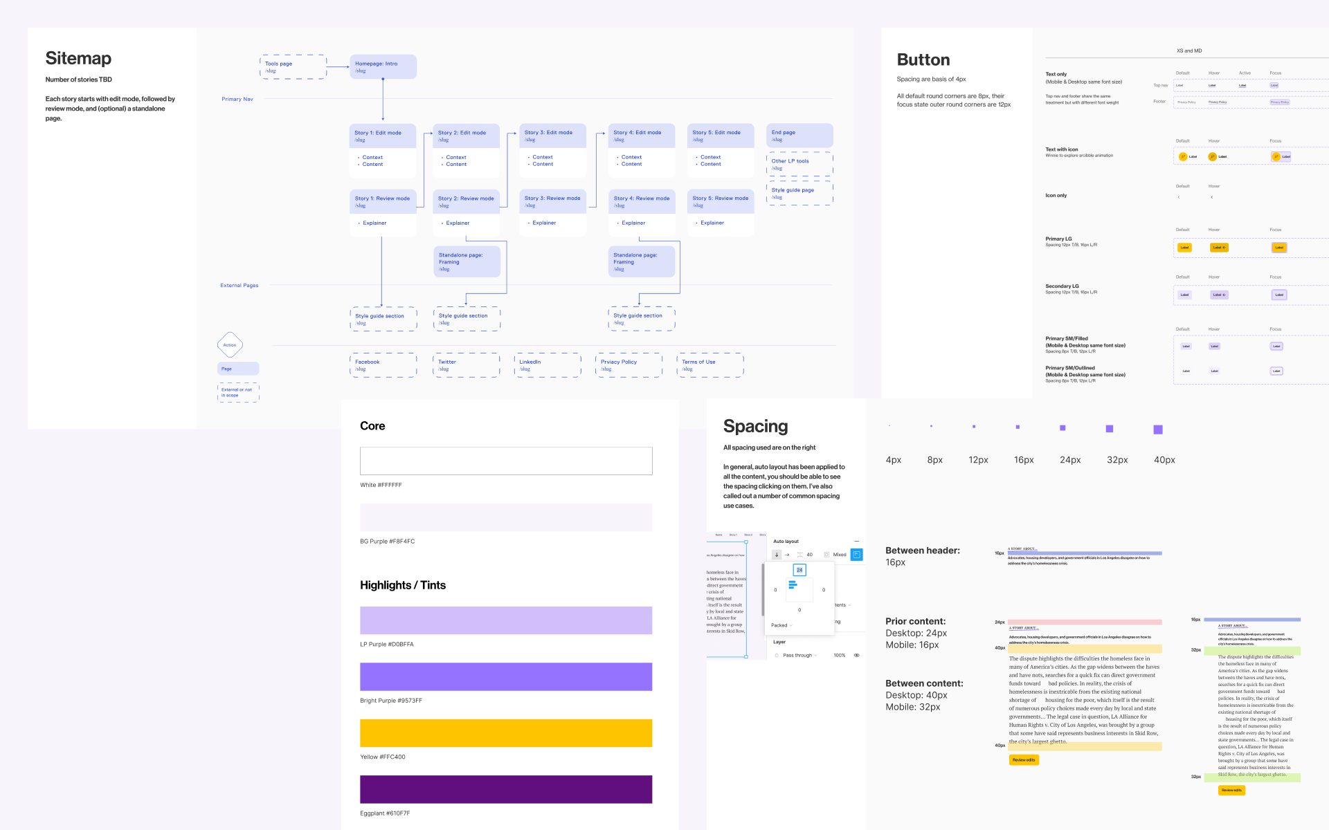
Title IX Investigations Tracing Colonial History Through Street Names Searching in Trump Tweets Survelliance Apparatus in New Orleans On My Mind: Watching from Afar Interpreting Hong Kong Police’s Narratives Faceless Heritage & Urban Development in Pokfulam Climate Change Weather App Back to Projects