
Swell
Swell is a headless ecommerce platform that helps self-starting entrepreneurs build complex commerce experiences.
Being developers themselves, the founders are well aware the importance of good documentation. To empower developers and agencies to self-onboard easily and discover the full potential of Swell, Swell needs a comprehensive and intutive documentation portal.
I was brought on as the sole Product Designer to help discover potential features, define site architecture, create wireframes, visuals, and build an accessible and maintainable design system. I worked closely with two developers and a strategist on Sanctuary’s side, and two co-founders and a technical writer on Swell’s side.
︎︎︎ Launch Project
Product Design · Visual Design
Company: Sanctuary Computer
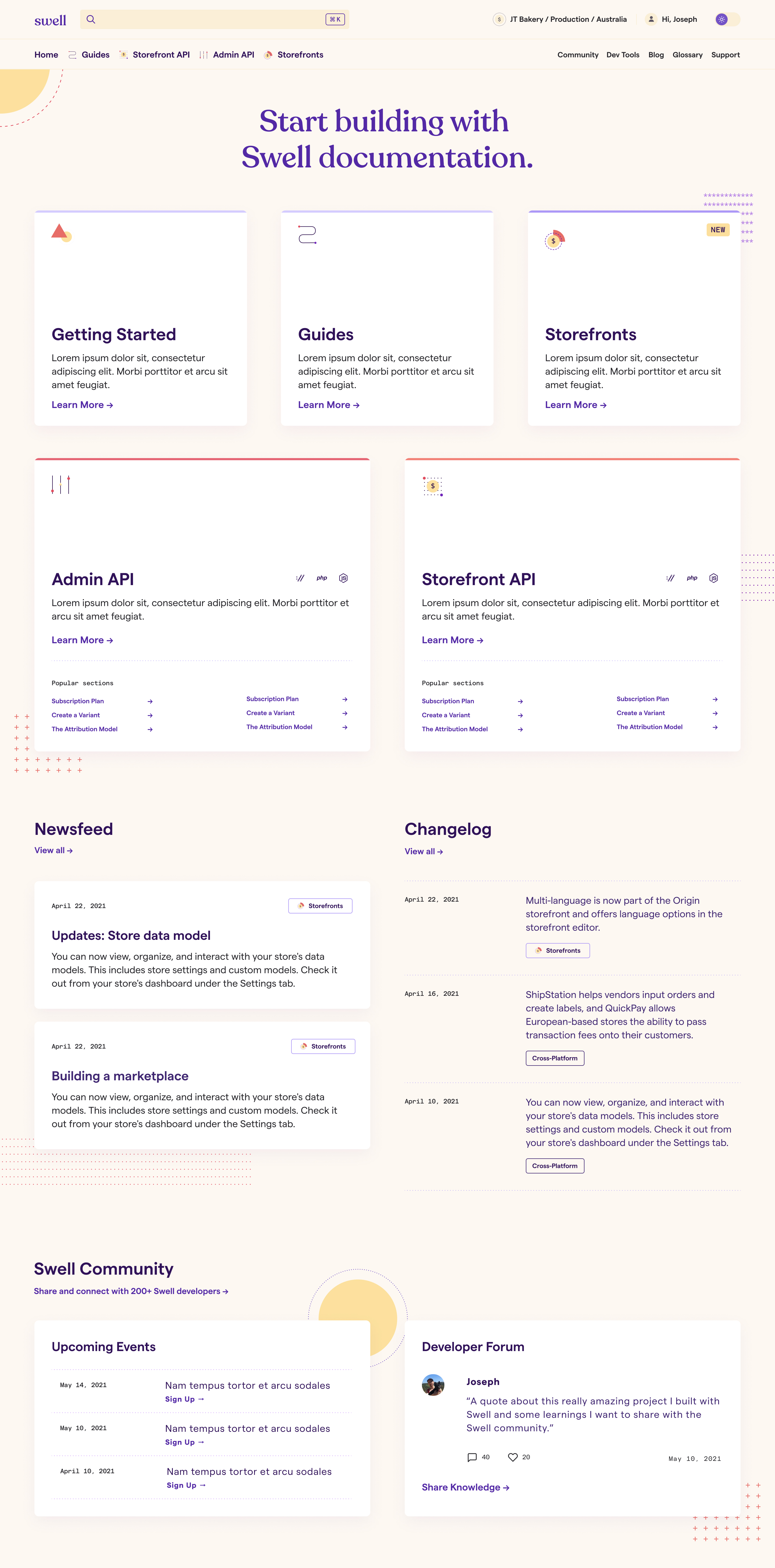
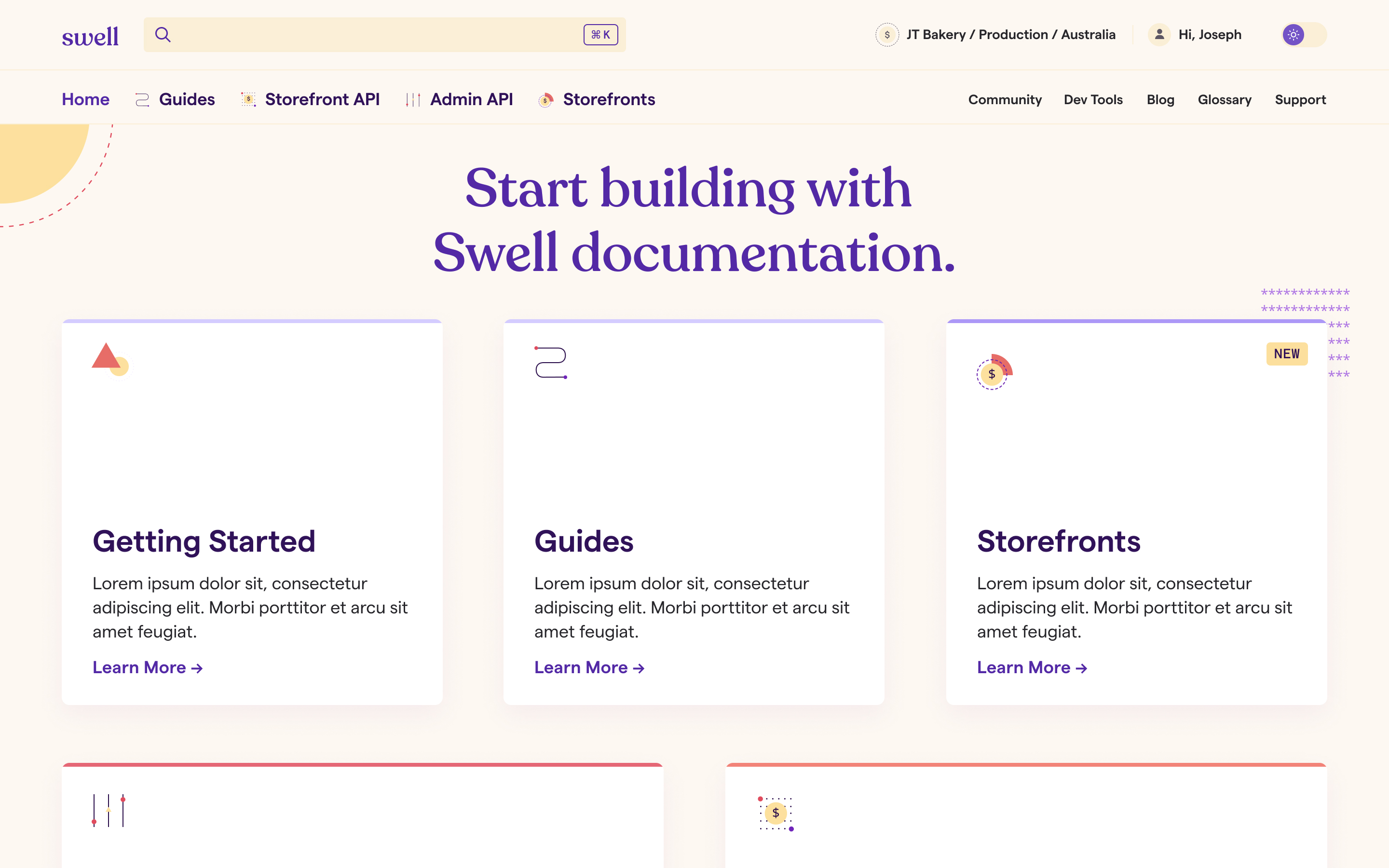
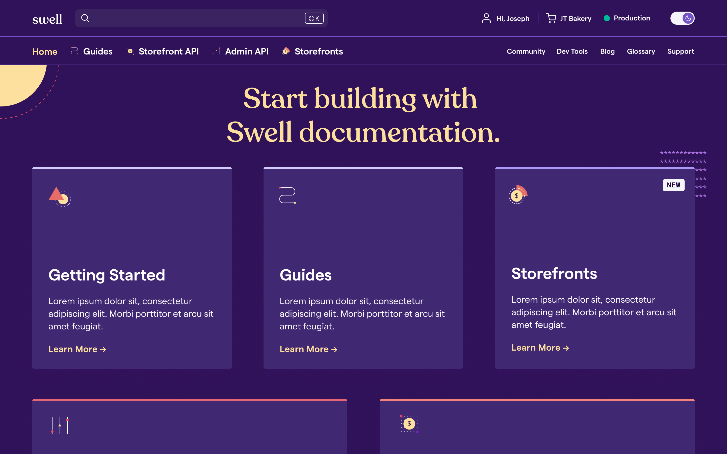
Before vs After
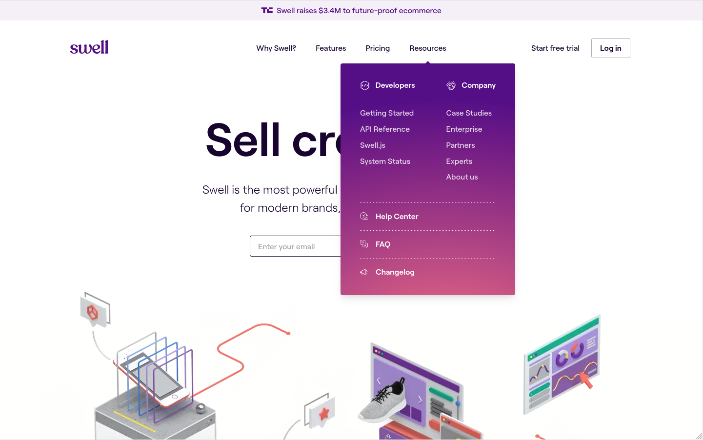
Previously, documentation on Swell is limited and disorganized — when developers click on the resources dropdown, they find a list of ambiguously named sections.
In the redesign, we gave thoughtful consideration from content, design, to development to make developers will have all the tools and information to start tinkering and Swell can continue to maintain the docs easily.
- Different sections is organized in a homepage, along with information around community and updates
- Clear hierarchy is established through typography, spacing, color, iconography and careful placement of global and flexible items
- New features such as associative navigation, MeiliSearch, glossary, light/dark mode are implemented.


Discovering Features
I audited a number of documentation portals to identify and brainstorm potential features with a developer and strategist on the team.
Content Structure & Wireframes
Part of the challenge was to organize the many components and sections we ideated around ambiguous content. While we wait for Swell’s technical writer to be onboarded and Swell’s team to create sample content, I used wireframes and site maps to gain alignment around content structure and we built the site starting from components ground up. This approach allowed for detailed conversations on each feature, helping us clearly define the shape of each component, and identify pages that need the most work, which made the transition to high fidelity designs much smoother.
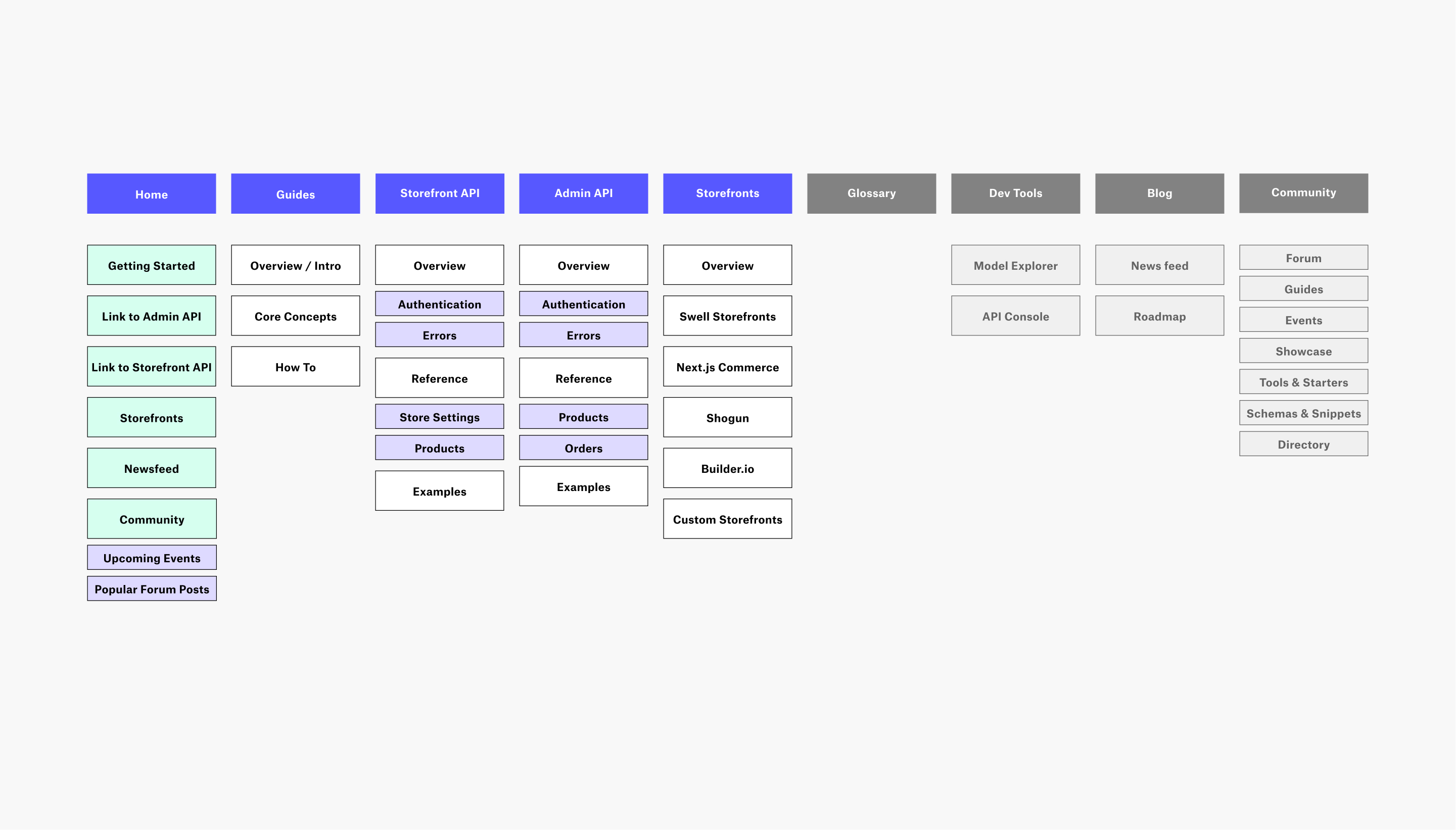
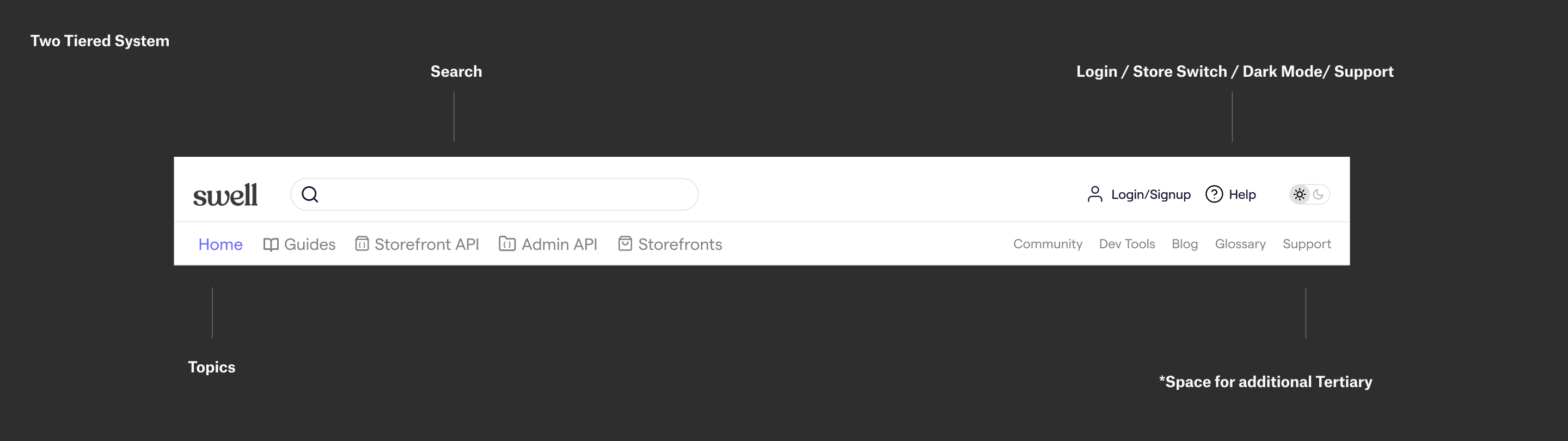
Two Tiered Navigation
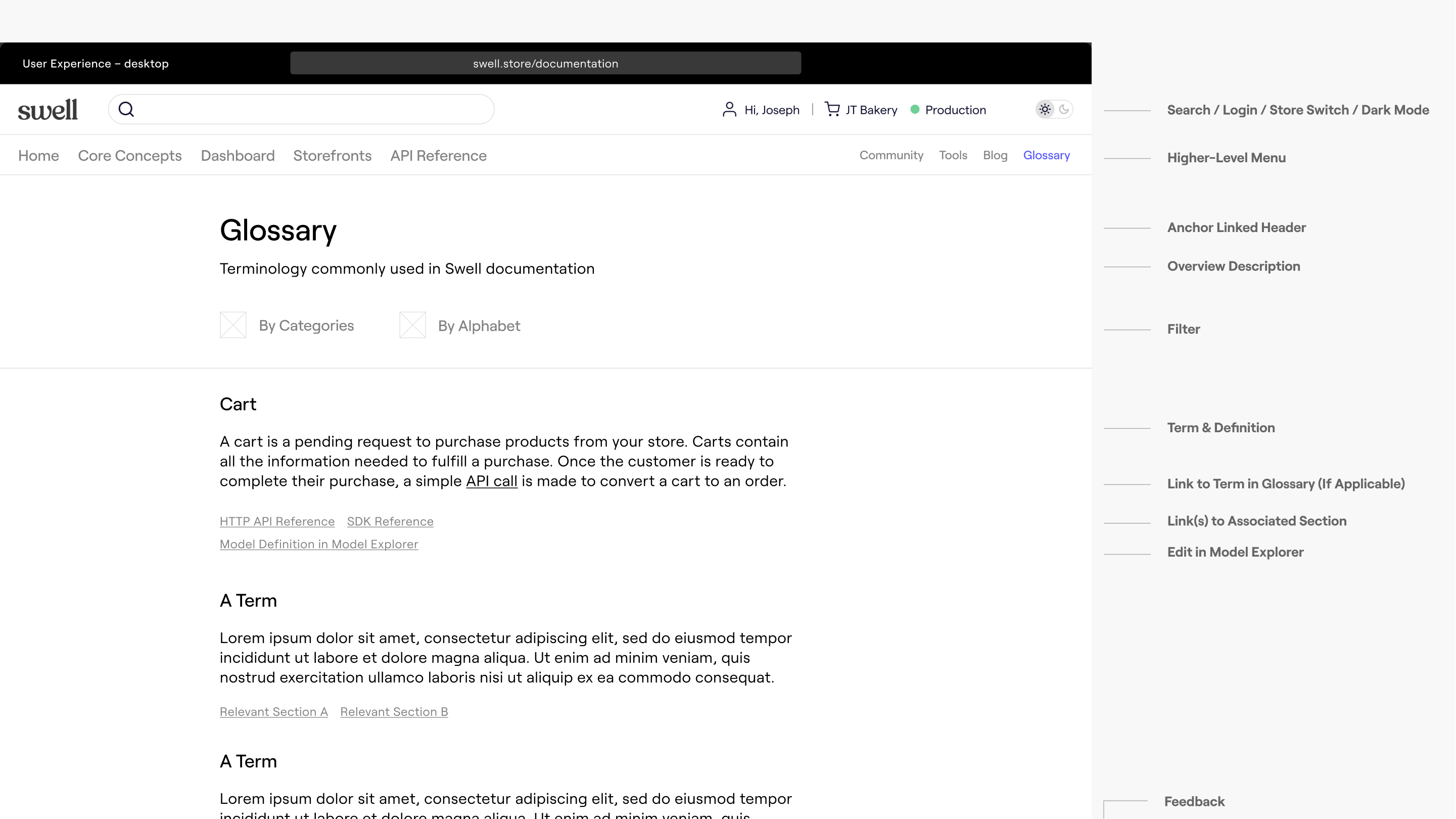
I designed a two tiered navigation to better organize the various topics and user/store specific information, and leave flexible space for teritary content that will be added post-MVP (e.g. Community content, Glossary).
I designed a two tiered navigation to better organize the various topics and user/store specific information, and leave flexible space for teritary content that will be added post-MVP (e.g. Community content, Glossary).
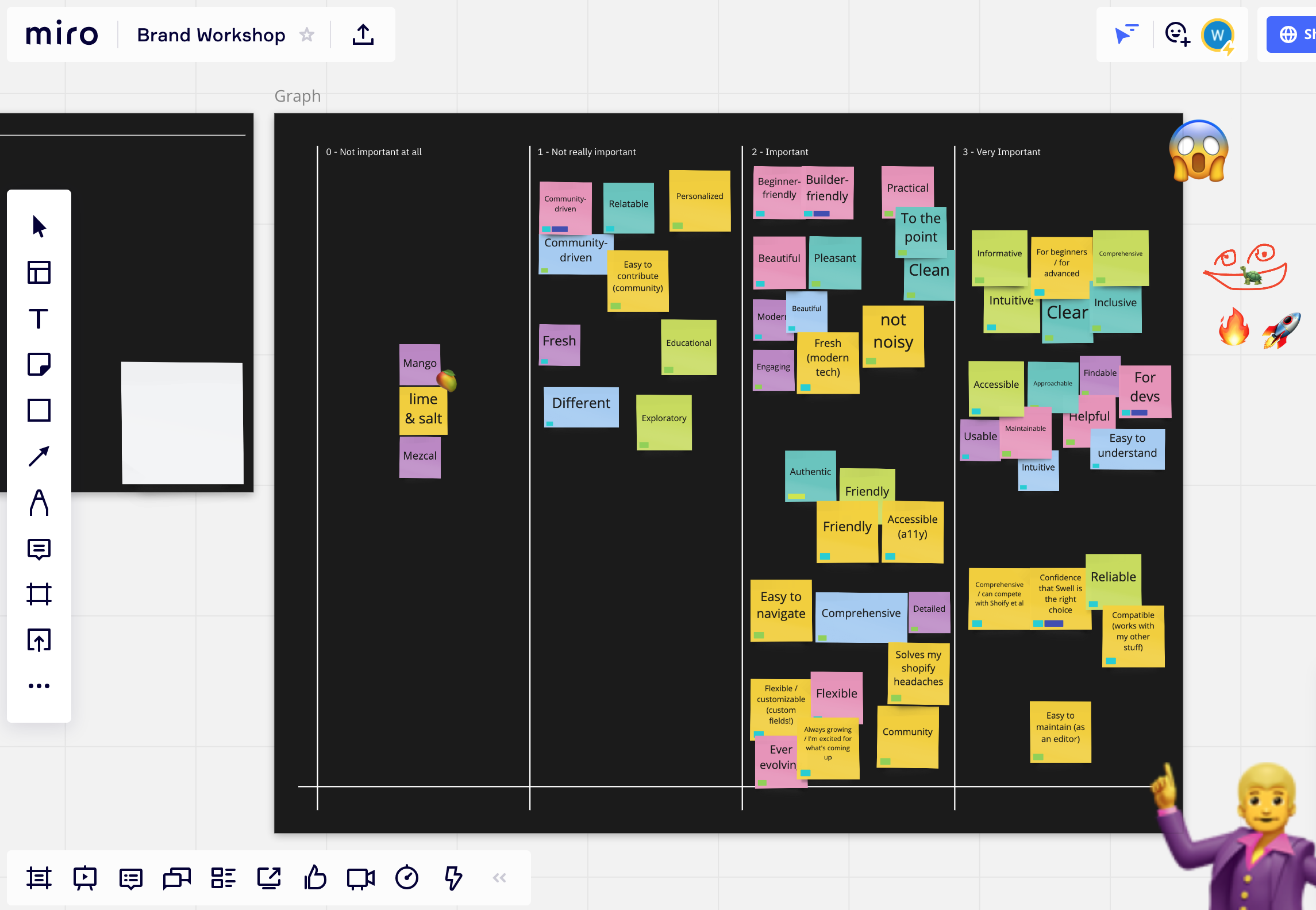
Brand Workshop
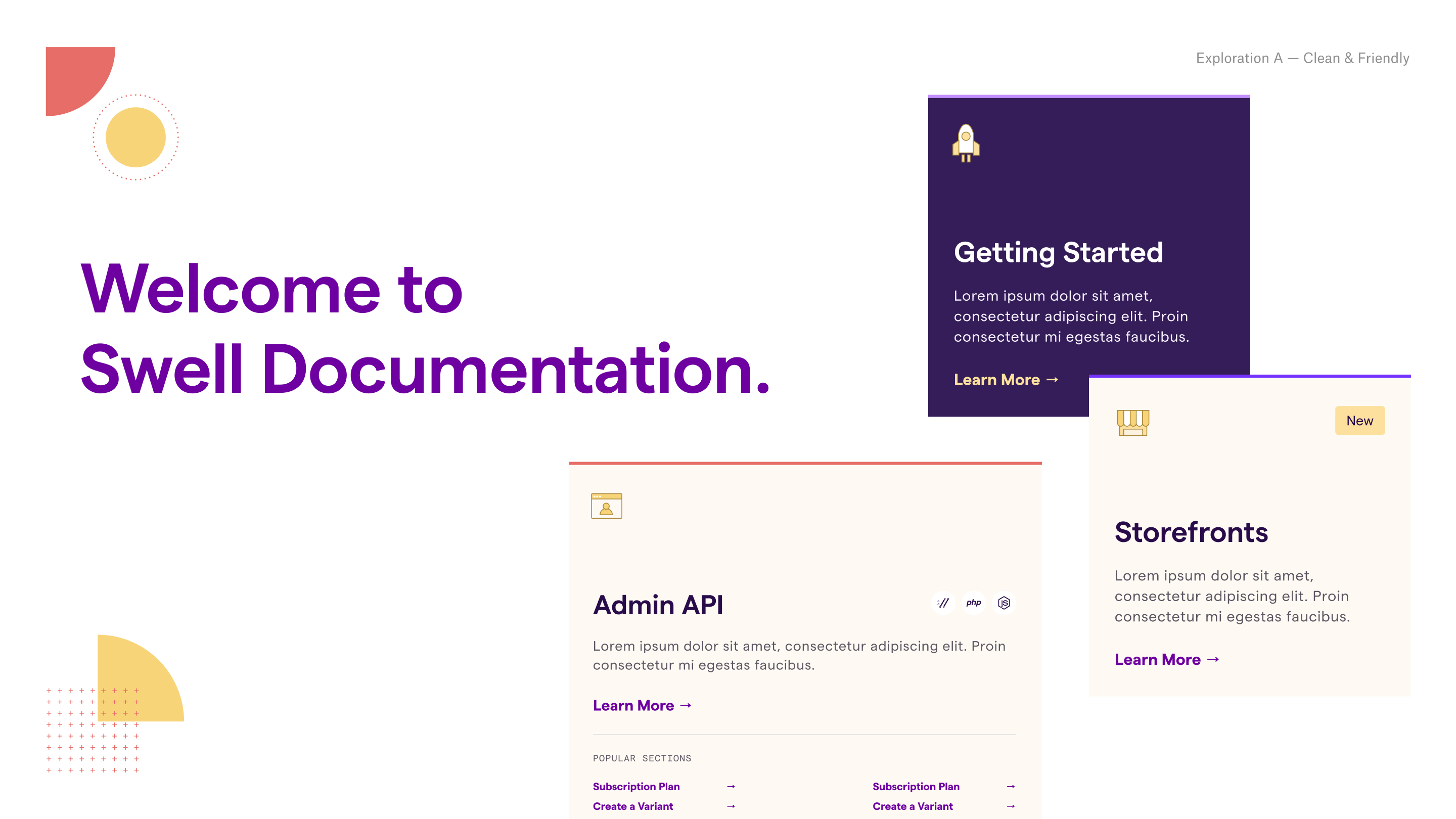
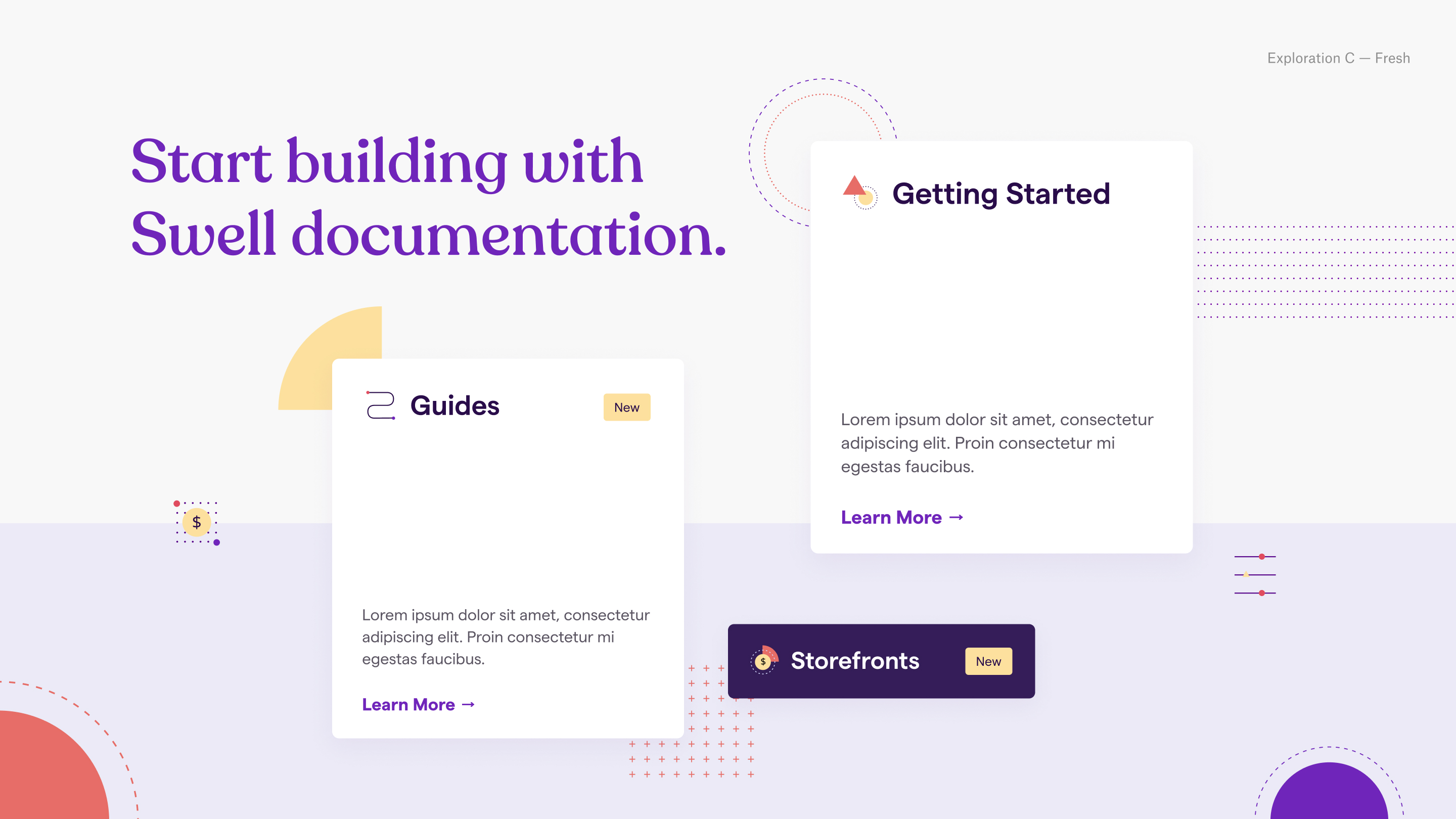
As we move towards visual designs, I organized a workshop to better understand how the team interprets Swell’s ambition, its underlying implications, and desired brand message. Afterwards, I created three different visual directions.
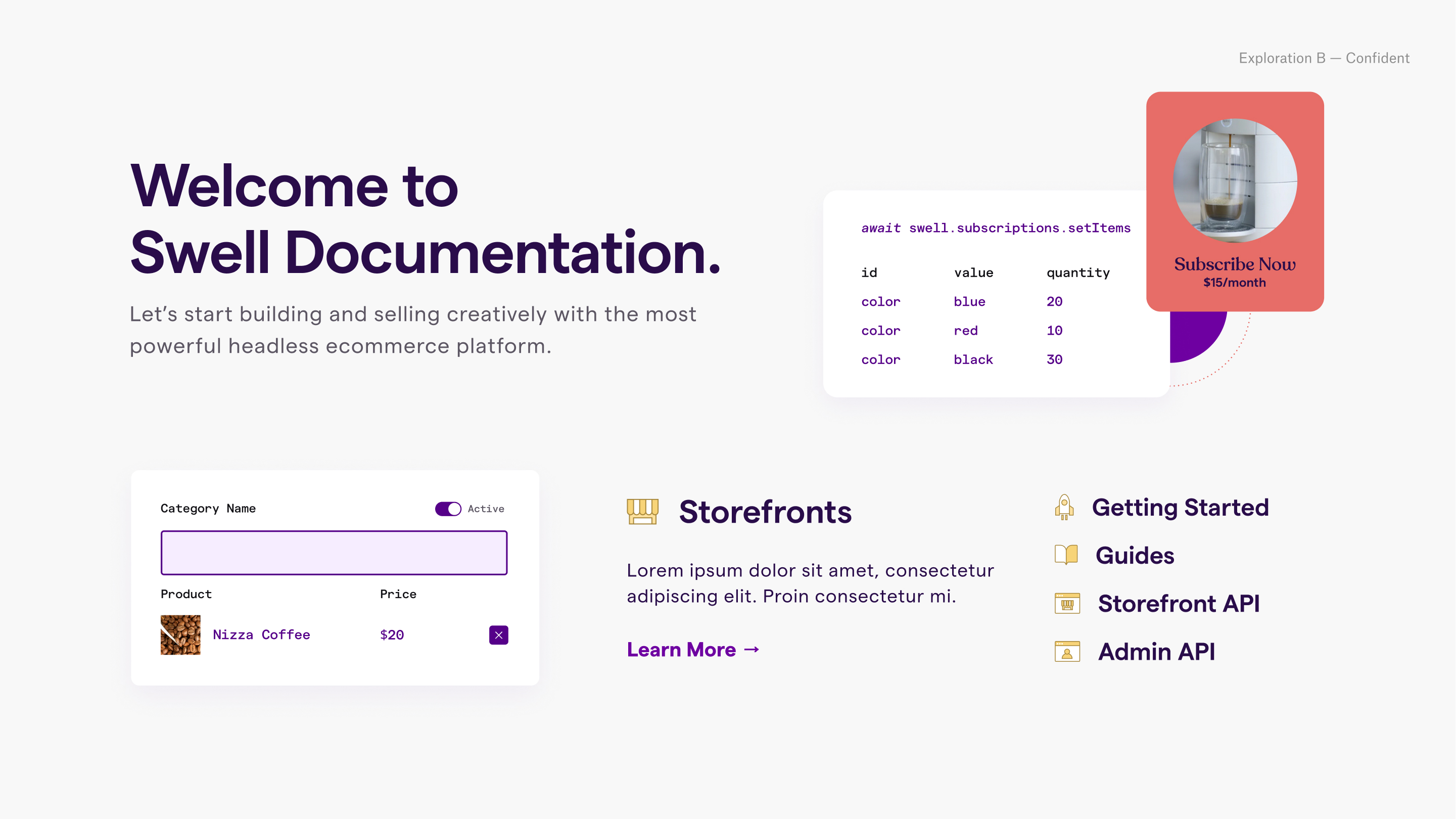
Visual Designs & Design System
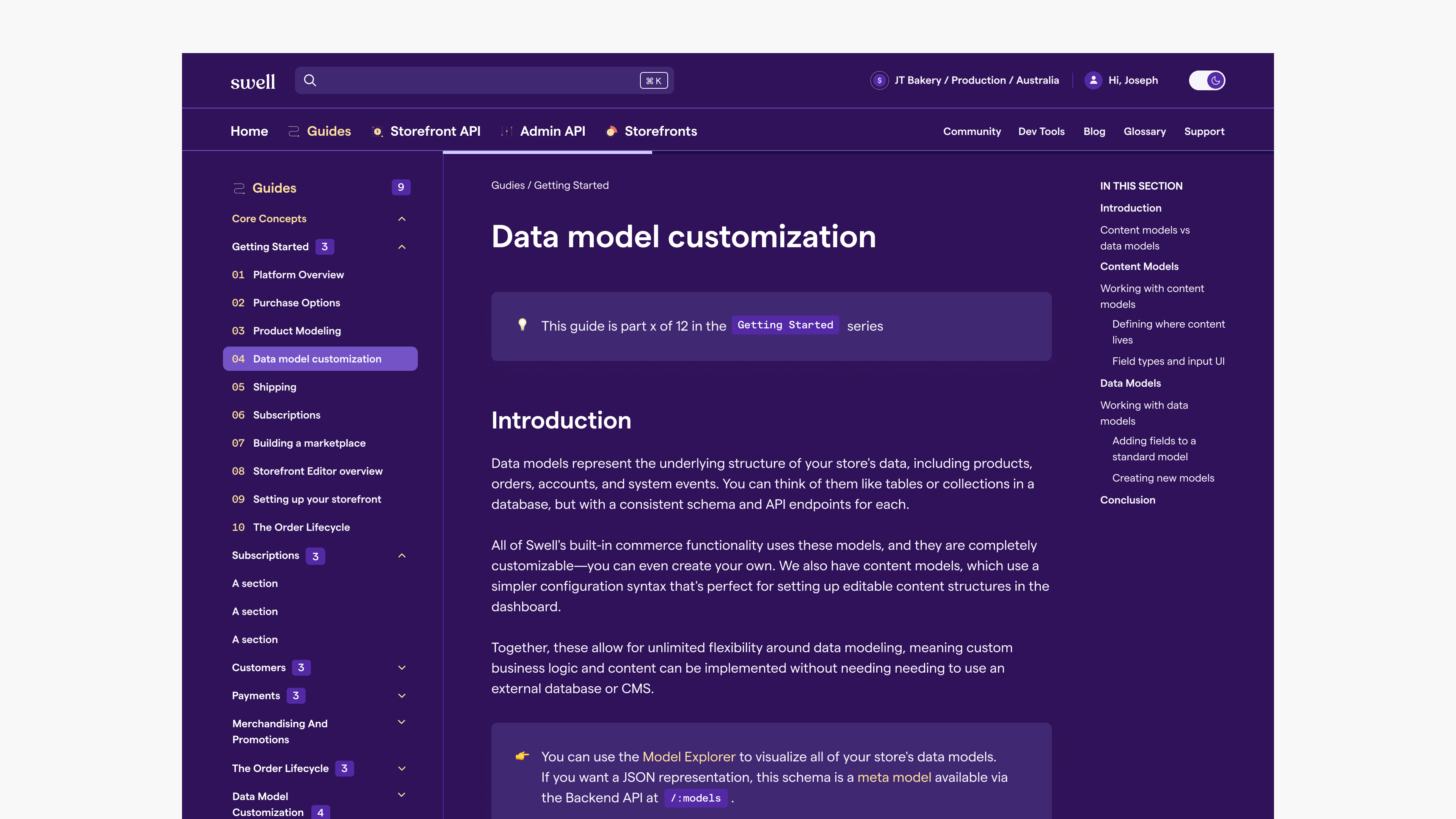
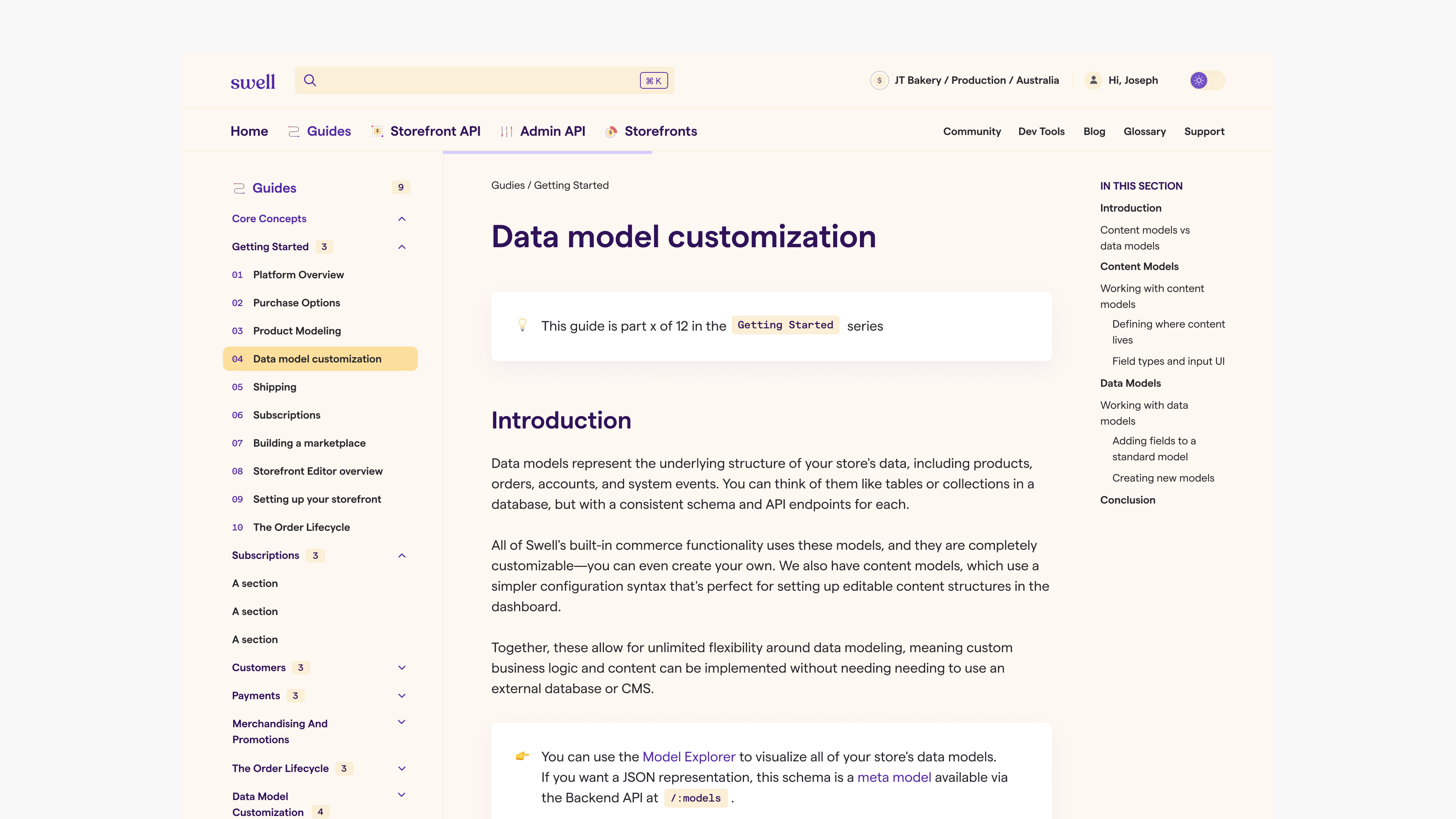
I created a fresh, warm, and friendly visual language using Swell’s typography and expanding on their new brand elements. I created designs for each section in both light and dark mode, prioritizing consistency across components and digital accessibility.
Design System & Component Library
At the same time, I build out a maintainable component library with clear documentation for design to dev handoff, using Figma Tokens and branches to manage theme consistency across color modes.
At the same time, I build out a maintainable component library with clear documentation for design to dev handoff, using Figma Tokens and branches to manage theme consistency across color modes.
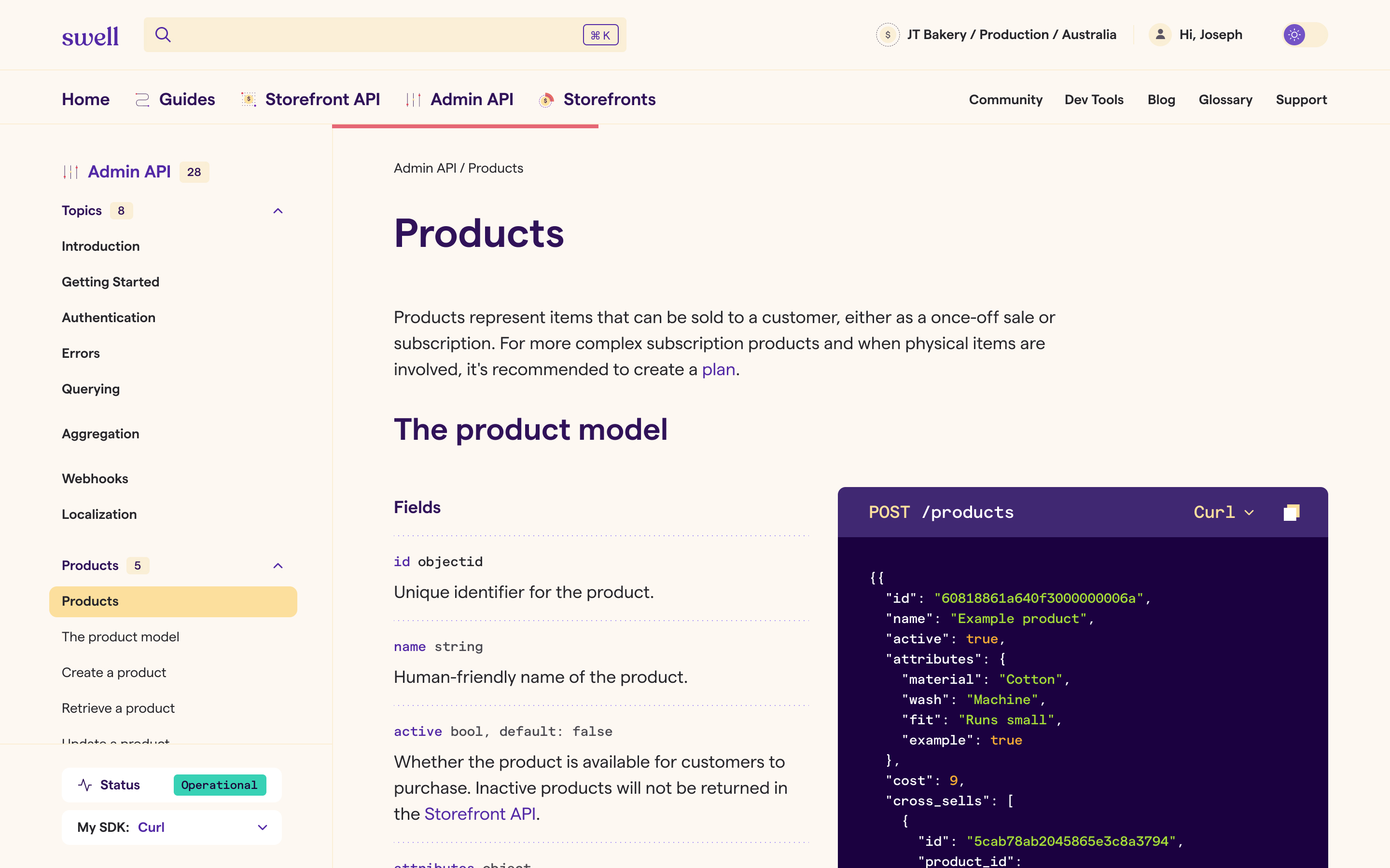
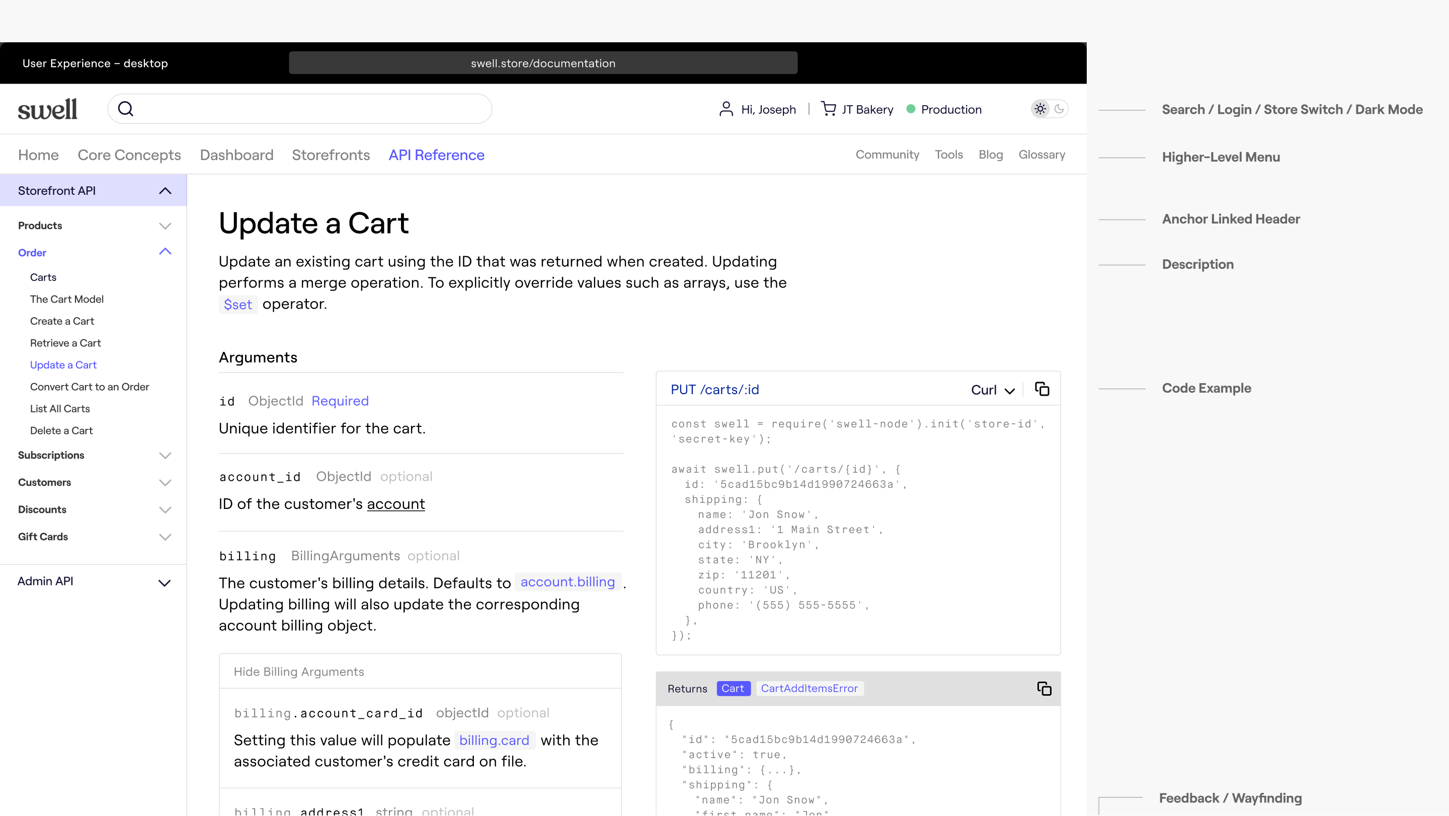
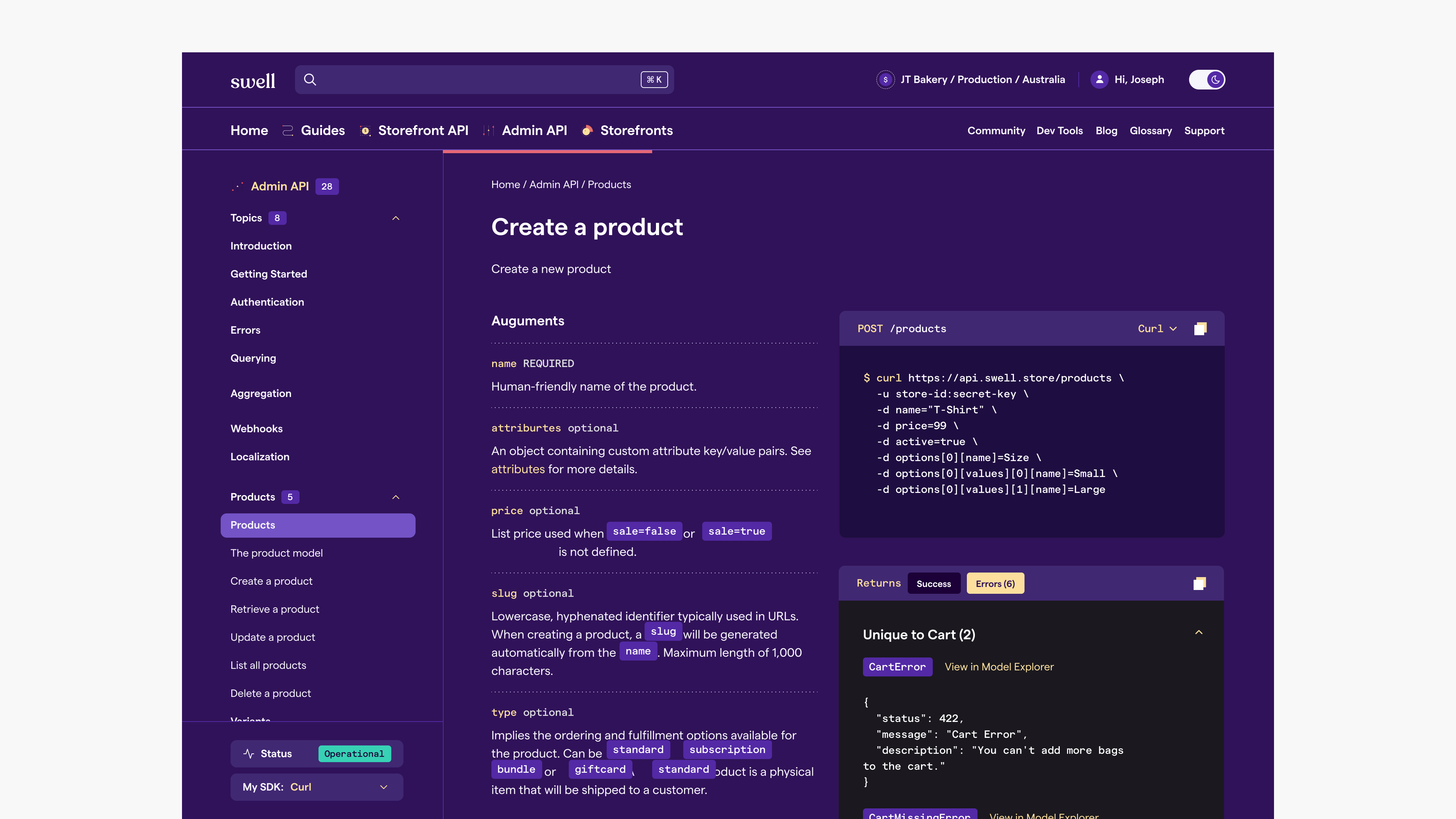
API Codeblocks
Method and return codeblocks are distinguised with dark purple vs dark grey background.
Method and return codeblocks are distinguised with dark purple vs dark grey background.
- If the codeblock is a method, develper can switch the code flavor and copy the code.
- If the codeblock is a response, developers can toggle between `Success` and `Error` results, view the model in Swell’s Model Explorer, and copy the code. `Error` results are organized by errors specific to the section and generic errors.
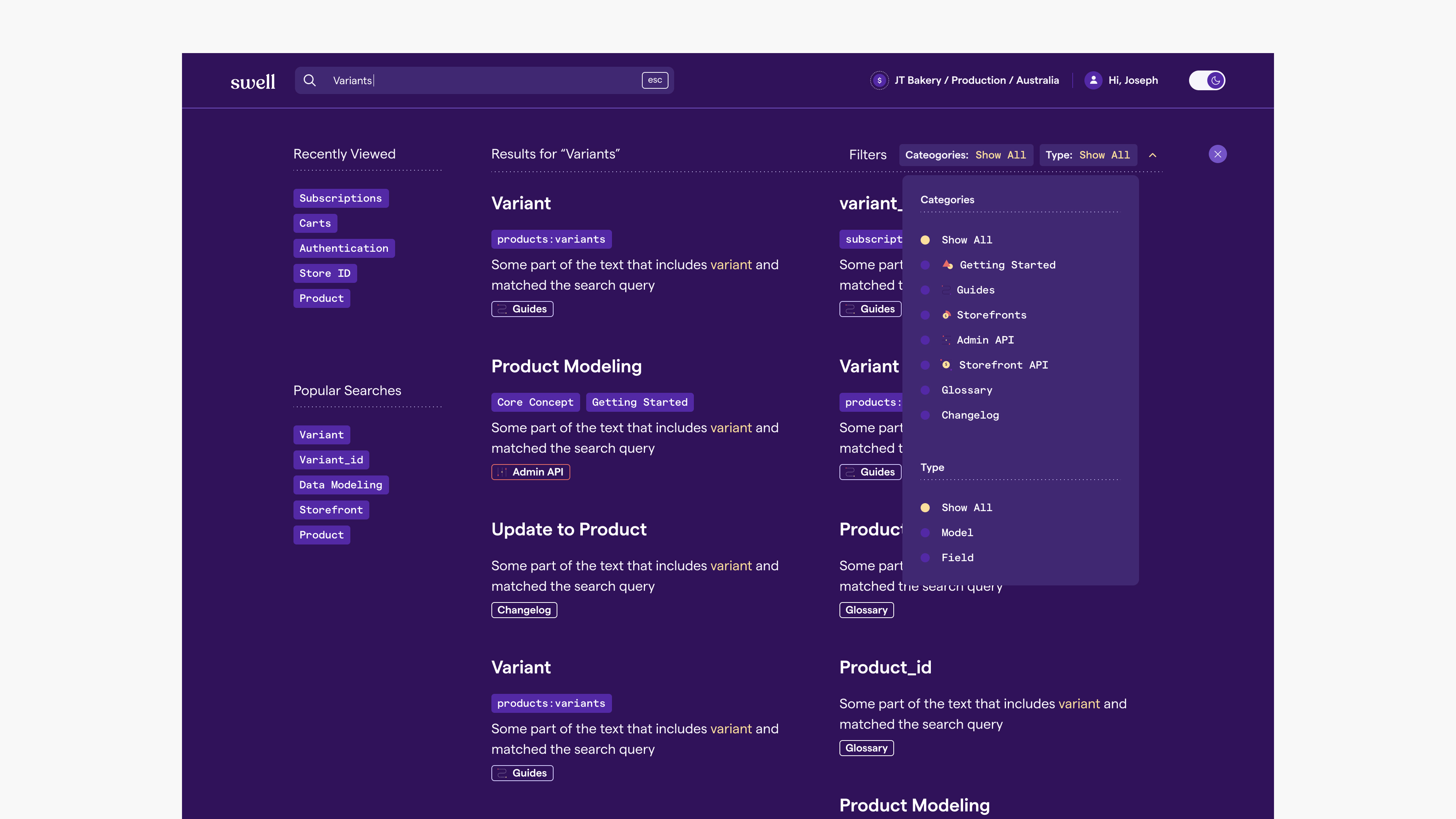
Search
Search is Swell is powered by MiliSearch, developers can see a detailed list of popular results (in empty state) or relevant results (after search term is entered) easily, and filtered through relevant sections.
Search is Swell is powered by MiliSearch, developers can see a detailed list of popular results (in empty state) or relevant results (after search term is entered) easily, and filtered through relevant sections.
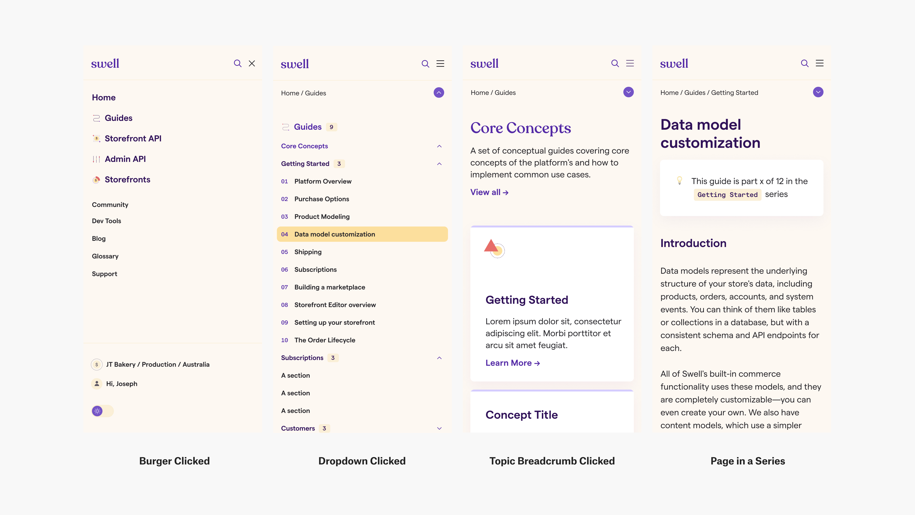
Mobile Navigation
On desktop designs, there are two levels of navigation — main topic and user info on top, section and pages on left — this needs to be collapsed for the mobile design. After a few iteration, we came up with a design that is both intuitive and optimizes space:
On desktop designs, there are two levels of navigation — main topic and user info on top, section and pages on left — this needs to be collapsed for the mobile design. After a few iteration, we came up with a design that is both intuitive and optimizes space:
- Burger to bring up main topic menu and user information
- Dropdown in topic pages to bring up the individual topic’s menu (e.g. Guides menu)
- Breadcrumb as a way of navigation instead of adding another level
Title IX Investigations Tracing Colonial History Through Street Names Searching in Trump Tweets Survelliance Apparatus in New Orleans On My Mind: Watching from Afar Interpreting Hong Kong Police’s Narratives Faceless Heritage & Urban Development in Pokfulam Climate Change Weather App Back to Projects